We’re dropping back in with some progress on the room above our garage that we recently finished insulating, drywalling, and flooring (aka: the former storage room that we hope to use for art / playing / movie nights & spillover sleeping space for visiting friends & family). There’s still lots to do, but we managed to complete one super useful slice of the room: the storage niche.
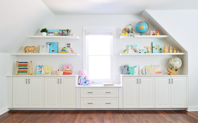
At first, that recessed space felt like a curveball to symmetry fanatics like us – it’s off-center in the room, it’s only 17″ deep, and it has not one, but two, sloped ceilings. But it was actually its narrow depth that triggered the idea for some sort of built-in. Plus we knew this big blank slate of a room would definitely benefit from some added storage and height / interest on that wall.
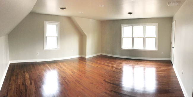
And oh yeah, we repainted the room in the middle of this project. We love Edgecomb Gray in every other room that we’ve used it, like the dining room and foyer, so it seemed like the obvious choice here since it was also in the adjoining hallway. But good ol’ E.G. was feeling strangely darker in this room (maybe because of the lack of west-facing windows?) so after a few weeks of trying to convince ourselves it was “fine,” we bit the bullet, broke out our rollers again, and lightened it up.
The winning color was Irish Mist by Behr, which is a very light gray with the slightest green undertone (guess that’s the “Irish” part?). It instantly made the room feel airier, so instead of seeing a darker space at the end of a long hallway, it’s a nice bright, light one, which we really like. Whew. Worth the effort.
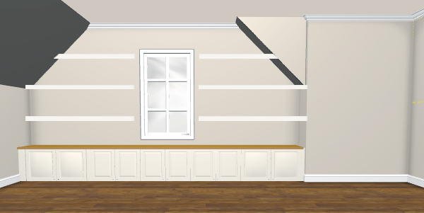
But back to the built-ins. We started planning them using Ikea’s kitchen planner tool to help us visualize a few options and pin down a final design. We’ve had a great experience with Ikea cabinets in our laundry room – which is adjacent to this room – so they felt like a good choice in here too.
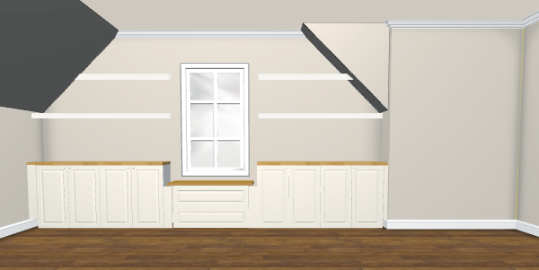
We started first with cabinets all of the same height: several 20″ tall above-fridge cabinets, since they’re the tallest we could go and not block the window. But even with three floating shelves – which we roughly added ourselves in Photoshop – it felt a little too low and unbalanced to us (and all those lined-up doors started to look a little dizzying).
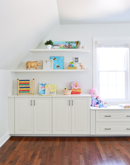
Then we tried the staggered look by using standard 30″ tall base cabinets on either side of the window with a 20″ drawer base centered under the window. We liked that the raised height felt more proportionate to such a large space and that the cozy little window nook seemed more custom. Plus that drawer base broke up all the cabinet doors nicely. (You already know this was the winner from our after picture at the beginning of this post, but pretend to be surprised.)
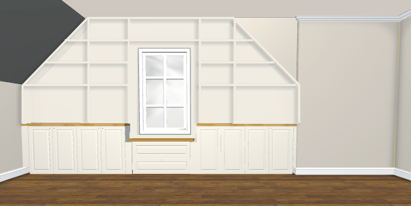
And just for kicks, we briefly considered doing built-in shelves versus floating ones. We liked the idea of something like this, but it felt like it might overwhelm the space and we wanted something that felt a bit more casual. So it was back to Plan B.
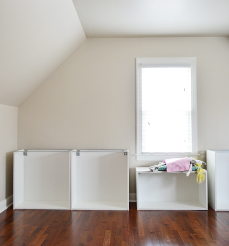
With our desired look pinned down, we took a road trip to Ikea (hitting up the National Zoo before heading home, which was awesome. Baby Panda says hi). Once back, we assembled the cabinet bases and things started to come together pretty quickly. They also apparently can double as doll beds, so that’s good to know.
Obviously we didn’t want the cabinets sitting directly on the floor, but the standard Ikea legs would’ve made them too high. So we built a base using 2 x 4″ & 1 x 4″ boards to lift everything up just enough to frame the window nicely. We also mounted 2 x 4s on the wall so our finished built-ins would better fill the recess for a more intentional looking result.
Ikea’s cabinet system now uses a metal suspension rail to hang all cabinets – even their base cabinets. I’ll say that we found this rail a little harder to work with than their previous system, mostly because getting everything level seemed very dependent on your screws being perfectly placed. The cabinets no longer bolt onto the rail, they just hook over the bottom lip, so they’ve eliminated the handy washer/clip that allowed you to fine tune each cabinet’s height after it’s hung.
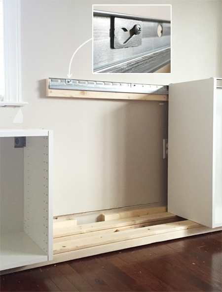
But with a bit of care we got them nice and straight, and other than that we liked having them attached that way – they feel very sturdy. And the wood base that we built underneath is good insurance for us in case they ever get sat on / climbed / body-slammed… although that’s not something we’ll be encouraging.
With everything attached, next up was screwing in a few filler pieces. Our space was a weird length (and the window was a couple of inches off-center) so without settling for a weird asymmetrical assortment of cabinet sizes, we were left with a few small gaps. Clamping these filler pieces in place and then screwing through the adjacent cabinet was a great way to get a strong and precise placement.
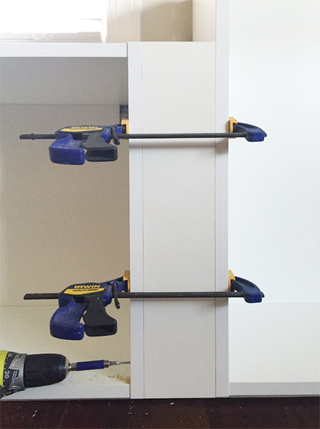
We also had to add a filler piece on either side of the window, since otherwise you’d see the crazy wood/metal rail contraption that keeps everything up. Luckily the girl at Ikea saw our plan and suggested that we buy two extra filler pieces, so we were all set.
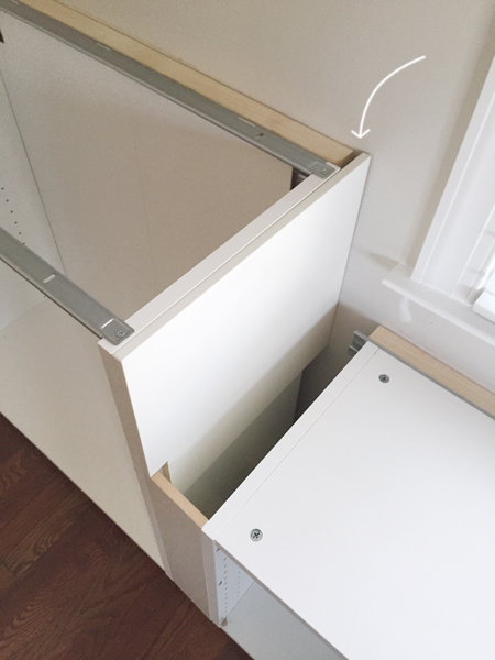
We went with the traditional BODBYN style doors, since they’re the most similar to our laundry room ones (which aren’t sold anymore). But once they were on, we realized that our filler pieces created these weird recessed portions. No me gusta.
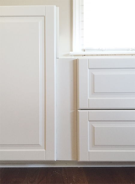
So we built them out with some scrap wood pieces that brought them to the same depth as the door and drawer fronts. And we just painted them to match (Soft Wool by Valspar from Ace, thanks to a Pinterest search that turned up a paint match to these BODBYN doors). Just don’t go to Lowe’s looking for it like I originally did (this color is only sold at Ace stores). The added pieces made a world of difference. It all looked a lot better once we had those in place.
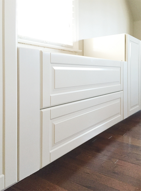
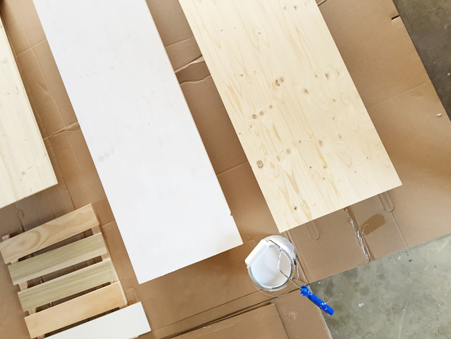
We considered doing wood counters (as you saw in our photoshopped renderings), but we realized that this niche (and room as a whole) would eventually be full of a lot of colorful and patterned things – so we opted to keep things simple. We bought some wood project panels at Lowe’s that would be deep and wide enough to cover each section without any seams, primed them, and then painted them Soft Wool to match.
When it came time to build our floating shelves, we figured we’d make some version of the ones Ana White shared with our readers back in the day. But when we held up some scrap wood to envision how that thickness would look (hers are 2″ thick), they looked a little heftier than we would have liked in the niche. But finding plans for slightly less thick floating shelves wasn’t easy.
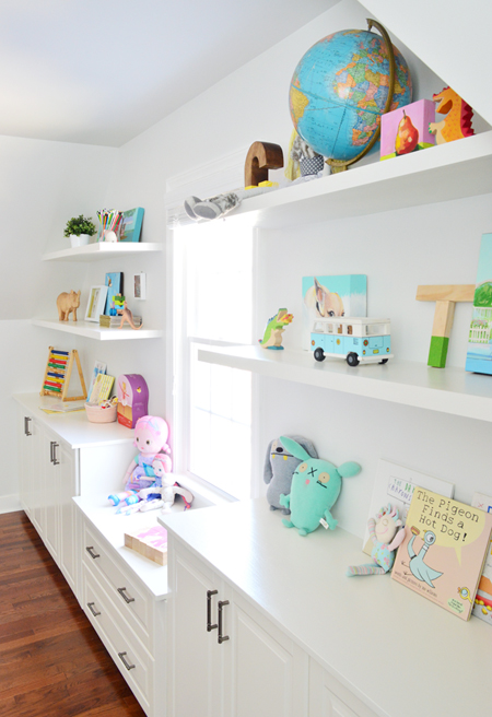
Luckily, Sarah at Ugly Duckling House had devised some skinny shelves for her kitchen and her technique felt like a great thing to try in here. It uses lots of 1 x 2″ supports like Ana’s plans, but it lays them on their side to achieve a lower profile. We realized we might lose some sturdiness making that change, but since we don’t plan on displaying anything crazy heavy (like tons of china, glassware, or a collection of Shake Weights) we decided to give them a try. Cue lots of wood cutting and pocket hole drilling!
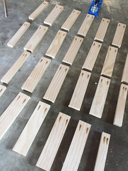
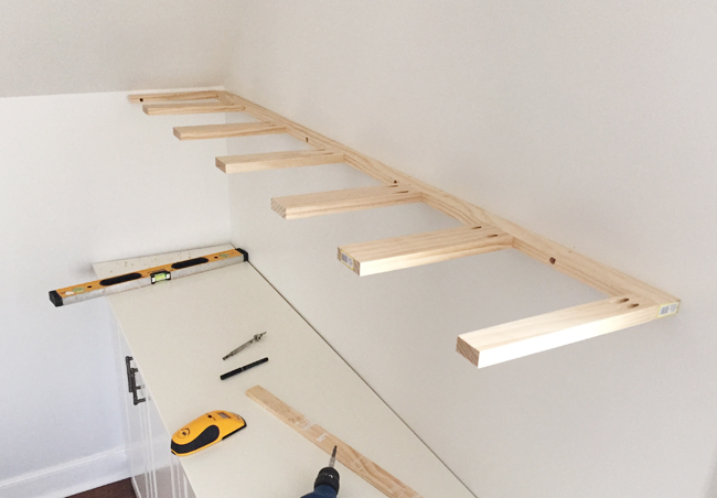
The photo above shows all of the “pegs” that jut out from the wall to provide the support for the shelf. Following Sarah’s plan, it’s a bunch of 1 x 3″ boards for the middle supports and 1 x 2″ boards on the end. We cut them in one sitting to ensure they were all the same length. Ours were 10.25″ in depth, which is the depth of our plywood shelf top (11.75″) minus the width of the 1 x 2″ that they’d all get attached to (1.5″). I’ll jump ahead to this photo of it installed against the wall, since it may help to see the finished brace.
To get the support pegs to jut out like that, we attached them by making pocket holes with our Kreg Jig. Clamping them while drilling was a great way to make sure they attached strongly and in perfect alignment.
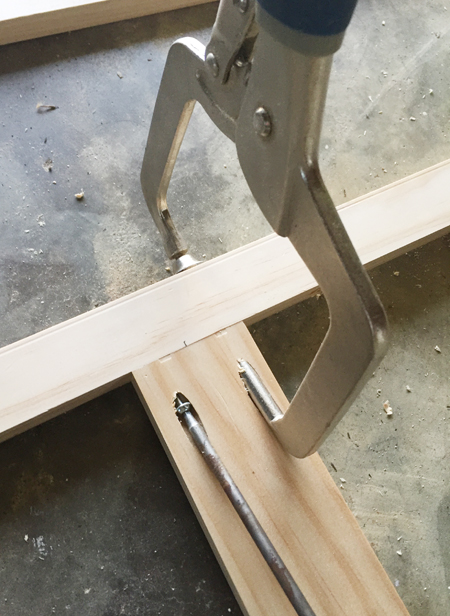
We erred on the side of having more support pegs than probably necessary – about one every 8ish inches apart. I say “ish” because we avoided putting one wherever we’d need to screw through the back piece to secure it to a stud in the wall. So it was helpful to mark those stud-zones before building anything so we wouldn’t have any supports in the way once we were ready to hang it.
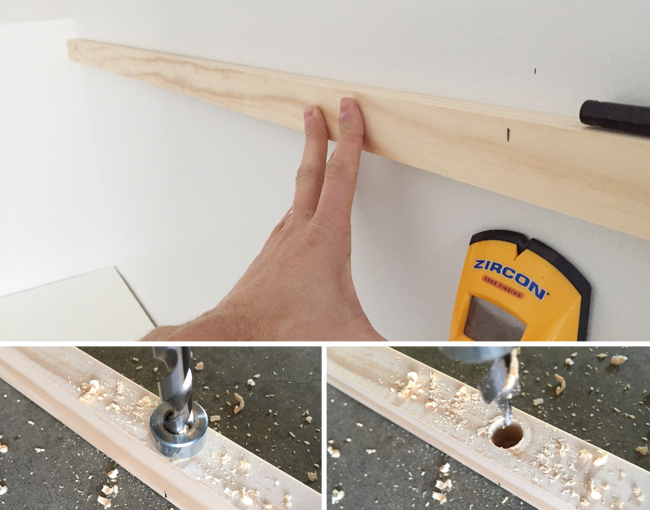
The other trick we used to make attaching everything easier was drilling some slightly recessed holes into our wood at each stud mark (the pocket hole drill bit that comes with the Kreg made this pretty easy to do). Since our screw would be going through the long side of the 1 x 2″, it meant we didn’t have to use a cumbersomely long screw to pull everything tightly against the wall for a sturdy result.
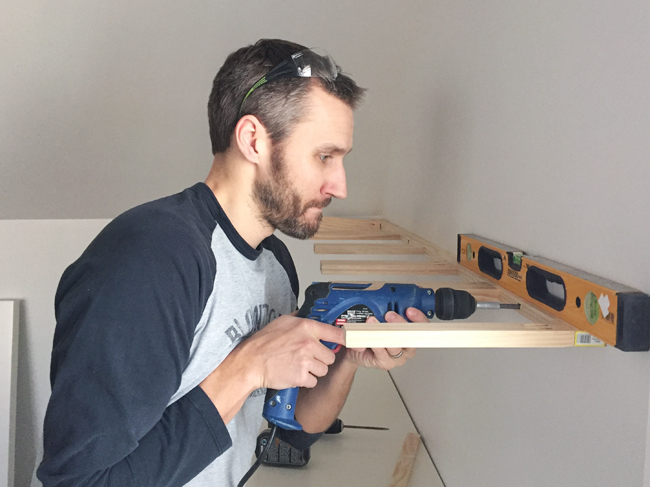
Once it was attached, we could add the plywood top to each shelf. This was a 1/2″ thick piece of sanded birch plywood. We had one 4′ x 8′ panel cut into 11.75″ strips at Home Depot, then we cut them to the right length at home on our table saw. Getting them cut at the store not only helped ensure they were all of equal width (their big saw is very consistent from cut to cut), but it was also easier to transport the strips home in our car. We attached them from the underside with 1″ screws so they’d be hidden once we added the bottom panel.
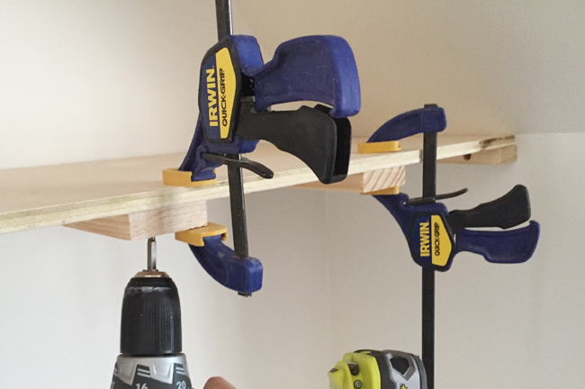
For the bottoms, we glued & nailed strips of 5mm thick plywood (which we also had Home Depot cut while the saw was locked into place for the tops). The thickness of these boards is really important, for reasons that you’ll see in a second.
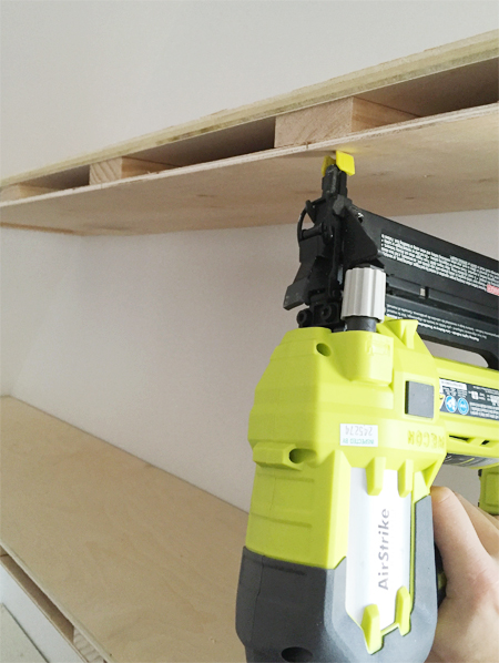
The last step to constructing the shelves is adding face boards, but the little pockets that we had created on the inside gave us an idea. We asked Clara if she wanted to write/draw a secret message to hide inside and she was all over that idea. Notes! Drawing! Secrets!
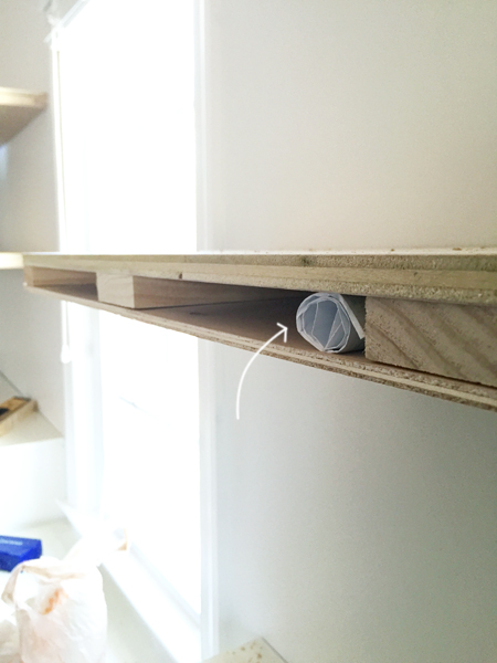
Once that important piece of business was complete, we finished off the shelves by gluing-and-nailing some 1 x 2″ face boards to the exposed front and side of each shelf. The 1/2″ top and 5mm bottom made the whole thing almost exactly the same width as a 1 x 2″ face board. The 1 x 2″ is just a hair bigger, so the finished product – well, once it’s primed & painted – looks like one solid piece.
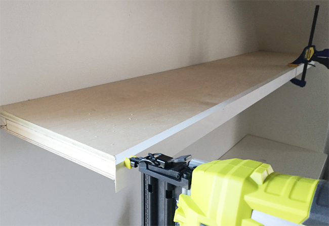
The shelves Sarah built had two side-walls to attach to, so I was a little nervous that ours – which only had one side wall each – might be precarious on the floating ends that are closest to the window. Thankfully they feel just as sturdy as the floating Ikea shelves that we’ve used for years (those don’t have any side-walls, and they’ve held big stacks of dinner plates/bowls/glasses just fine). We’re still not going to overload these with anything extra heavy, but I was pleasantly surprised by how solid these feel.
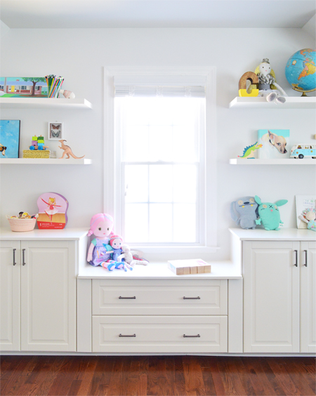
We love the impact that all of this vertical storage has had in this otherwise sparse/hodgepodge room so far. Not only does it help the room feel a bit more finished, but it totally signaled to the kids that this is a playful and fun space for them to settle into. They have been bringing in toys and stuffed animals from their rooms already, so this space is getting lots of action – which is definitely nicer than the years it dutifully served as pillow storage.
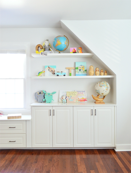
And as for the cabinets below (here’s an affiliate link to the hardware), we’re still slowing populating them with stuff like games and puzzles and doll clothes and blocks. Clara keeps asking when we’re going to “fill them with snacks.” I’m not entirely sure where she got the idea, but I’m not entirely convinced it’s a bad one…
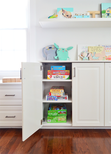
So that’s the story of our narrow little niche that’s now serving up a ton of functional concealed & open storage for us. And it’s pretty great to have a whole new view when we walk down the hall.
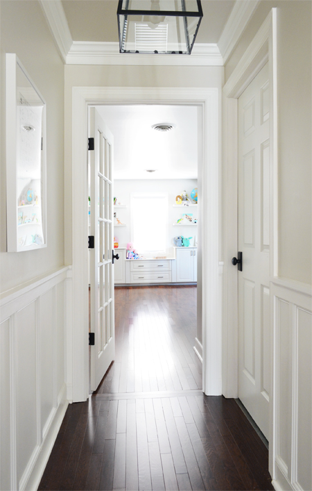
Especially since this was the view back when we bought this house…
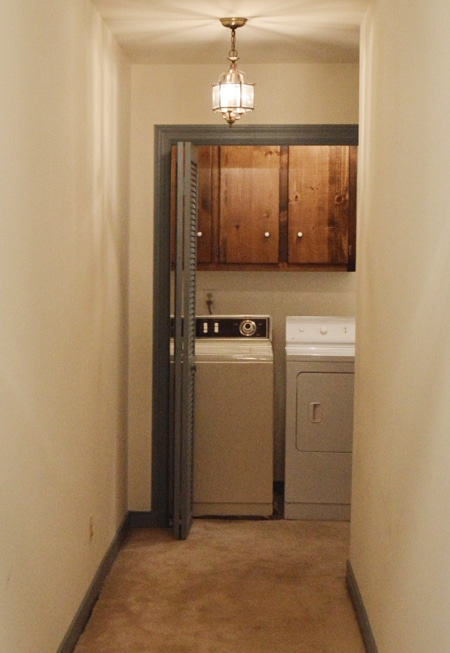
… with this unfinished space hiding behind it.
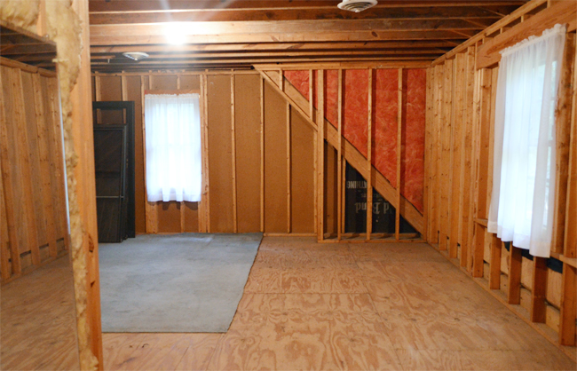
Ah progress. As for the rest of the room, we’re going to keep plugging along, and once we get it feeling a little more finished we’ll drop by with some wider room shots. Maybe we should just fill the whole thing with snacks. Just kidding. Kind of.

P.S. You can check out all of our current house’s updated before & after pics and see all of our paint colors & where we got things.
No comments:
Post a Comment