After last week's
design dilemma discussion on pendant lights in a kitchen many of you asked me to do a post on how to coordinate pendant lights with the chandelier you hang over the table in your breakfast nook. Making design decisions can be tough and it's often hard to visualize how something will look before it's installed. You want the lighting to flow but not be overly matchy-matchy, and with so many options out there finding a winning combination can be kind of intimidating. So today I'm sharing a few thoughts on the subject, some simple ideas to help you make confident lighting selections in your kitchen.
First lets's start by looking at some examples of kitchen lighting done really well. Let's dissect what makes these examples work.
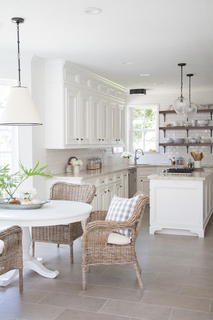
I'm pretty much in love with every detail of this kitchen, but the lighting specifically adds a nice touch of modern glamour to a traditional white kitchen. I think it's a good idea to figure out what will be the main lighting attraction in your kitchen and open dining area. Basically, who is going to be the lead actor and who is going to take on a supporting role? Everyone is important to the play, but not everyone is a star, you know? In this example below, the white shades are supporting actors and the chandy is the Oscar winner. I mean I realize they can both be winners, but you get what I'm saying right? The pendants blend in with the white cabinets, yet the gold marries them to the chandy. The style of the pendants fits in line with the sleek modern glamorous look, but they don't compete with the structural beauty of the chandy hanging over the table. It's almost like they're pointing you over to that gorgeous beacon of gold light. (I know I'm crazy; roll with it.)
 |
| via Home Adore - Dunbar-Southlands House by Terris Lightfoot Contracting |
Here the pendants and chandy play off of eachother both in the polished chrome finish and the round shape. But here again the chandy is the main attraction, and what keeps things interesting is that the lighting over the table brings in another layer - the white fabric shades which also relate back to the white cabinets.
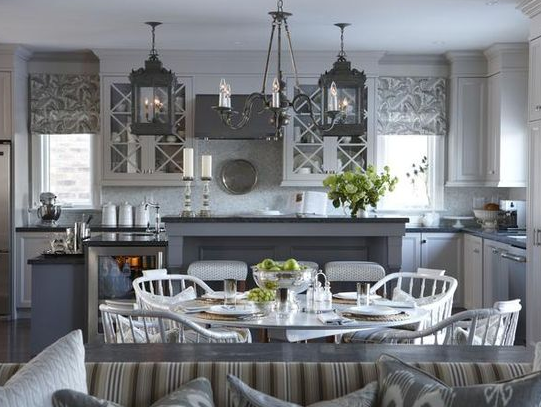
Now here's an example where the pendants are the main attraction and the chandy is kind of taking a back seat. The lighting flows in color and style, but what keeps things interesting is the different shapes and bulk. The pendants are much heavier, bulkier than the chandy. If the chandy met the same bulkiness as the pendants there would be too much visual competition. As is the pendants stand out and the lighting flows really nicely.
I like this next example because it shows that you don't have to marry styles in order for things to coordinate. The pendants are glass and the chandy is metal, but they work well together because the color of the chain matches. Also notice the flush mount over the sink tieing the black and white color palette together just perfectly.
So to sum up here a few tips for coordinating your kitchen lighting:
1. Choose a main player - chandy or pendants - and work from there.
Once your main player is selected:
2. Marry one or two things - whether it's the metal finish, the overall style or shape - find a couple of common elements. You want something about your lighting to match. You just don't want everything to match.
3. Vary the other elements. So if you have the same shape and finish, mix metal with glass, or glass with a fabric shade. Find something that offers a little something different than your main player does.
To give you a few examples, here are few combinations I like.
So notice in the rustic, traditional combo the
pendant is square and the
chandy is round; but the wood and iron marries them. In the sleek, industrial combo both have a round shape and are dark in color, but the pendant is glass. The cool, modern mix is the most different match up, but the modern style and dark elements tie them together.
Here again in the traditional, classic combo the round shape and nickel finish marry them, but the fabric shade with the glass shade of the
pendant keep them different enough to make the combination interesting. The modern, glam combo has gold and glass in common, but the different shapes keeps them from being too matchy-matchy. The casual, elegant combo is an interesting mix with two really different styles, but the
dark metal shade of the pendant coordinates with the black iron of the chandy allowing it to take center stage but brining in a more casual vibe.
I'm no expert, but hopefully this helped you to figure things out and gave you some ideas for coordinating lighting in your kitchen. It's not an exact science and really just depends on what you like and the overall style your going for in your home. Below you'll see how one simple glass ball pendant could easily coordinate with two different chandys depending on the overall design style you want to achieve. With the
wood bead and and iron option you create a modern farmhouse feel, yet with
the rectangular glass and iron option you get a sleek, industrial, casual vibe. Both work, just depends on the overall look you're wanting to create in your home.
What are your thoughts on coordinating lighting in your kitchen and open dining areas? Any favorite combinations?
If you have a design dilemma you'd like to submit - email me here - Carmel@ourfifthhouse.com


No comments:
Post a Comment